Life Management via Sunrise
Life as an MBA is demanding. Leave it to a bunch of Type-A’s to have the collective efficiency of a German automotive factory when it comes scheduling events. A typical weekday will involve a full load of classes mixed with all kinds of group meetings, informational chats, mock interviews, and club meetings in addition to various events at night. Somewhere in there you need to find time to eat, do homework, exercise, research jobs and prepare for interviews along with any other errands on your ever-increasing TODO list. Because of this inexorable grind, time management is an ongoing battle in business school, however, I have found the katana that gives you an edge in this fight—the calendar app, Sunrise. Sunrise is a calendar app for web, iPhone, iPad and Android, though I only use it on my iPhone. It pretty much runs my life, telling me exactly where I need to be when I need to be there. It has rightly earned a spot on my home dock and I love using it for three reasons:
1) Intuitive user interface
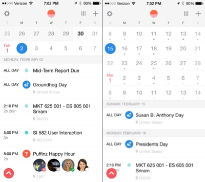
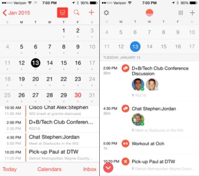
Designing an information dense calendar for the screen of a smartphone is challenging because a user may want the micro-view of the day while also desiring the macro-view of the week or month. Traditionally, apps have made the user decide between a daily, weekly or monthly view—pick one and only one. However, Sunrise has created a hybrid view that gives you deep detail for the day while also providing context for the broader week/month. This is such a killer design that other calendar apps have imitated this view, including the iOS native calendar app. Sunrise, however, has taken it one step further by dynamically resizing the height ratio of the monthly view to the daily view depending on if you’re looking more than two weeks into the future (i.e. the daily view will display less events if you’re looking more than two weeks into the future, more events if you’re looking at today). Yahtzee! UX at its finest! I love this because it’s based on the understanding that you don’t need detail the further you look into the future. This simple insight is built into the design of the app, showing a deep understanding of the user and her intentions.
2) Integration with events APIs
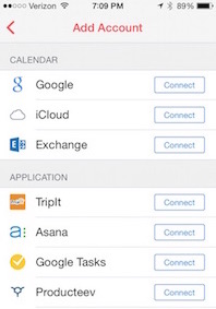
Sunrise doesn’t expect you to rebuild your life on a new calendar platform. The creators knew that people most likely already had a primary calendar backend: be it, Exchange, Google Calendar or iCloud. The creators of Sunrise instead assumed you used one of those three and focused on making the app integrate with every single API under the sun (pun!) that could possibly be a source of events: Facebook, Trello, GitHub, Eventbrite, Asana, TripIt and many more. They continually add support for additional APIs, thereby linearly increasing the utility of the app.
3) Icons Based on contextual inferences
Last but not least—Sunrise derives context automagically giving you visual clues about your event; no manual effort required. This feature is understated, but extremely powerful. For example, under a meeting event it will display pictures of the attendees sourced from their Google+ profile so you can immediately discern who you’re meeting with. This is pretty cool, but Sunrise really ups the ante utilizing NLP on event titles to infer activities and display relevant icons. For example, if I include the word “chat” in my event title I get an icon of a word bubble; likewise, “workout” will render an icon of a barbell and a trip to the airport will display an icon of a plane. This minute detail of the UI allows the user immediately grok the context of her event without having to read and mentally process the event title. Guru on usability, Don Norman, refers to this as minimizing the cognitive load. Humans have a limited amount of mental processing power, so by reducing the amount of cognitive load you impose, you increase the likelihood of your user completing your task. In this case, my task is to understand what I’m supposed to do next. A subtle contextual icon of a word bubble aligns me quickly to the understanding that I have a one-on-one meeting scheduled without me having to read and process text. I’m primarily fueled by a reservoir of coffee that depletes throughout the day, so this feature is amazing.
My takeaway: it is possible to innovate and differentiate a product in a crowded space, like that of calendar apps. Oftentimes, seemingly small visual elements can have a dramatic effect on the user experience and it’s these details that can be the difference between showing up to an important chat in a bespoke suit or gym clothes.