Gamifying Daily Activity with the Nike Fuelband
This Christmas I received a thoughtful gift for a fitness-focused techie like myself, the Nike Fuelband. Two years ago I had tried the Nike+ running product, consisting of a wireless sensor in your shoe and a receiver attached to your iPod Nano (now Nike+ support and a pedometer are built into the iPod Nano), it tracks your runs and gives you real-time feedback, kind of like having your own personal Apollo Creed in your left ear. After using Nike+ for a summer, I gave up on it, frustrated after it repeatedly misrecorded my mileage, even after I calibrated the device on a treadmill. Nevertheless, I was eager to try out the Fuelband because I’m really fond of the idea of collecting data to track and improve my workouts.
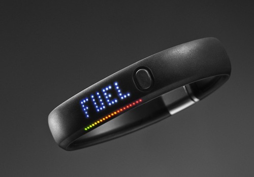
Out of the box, I admired the Jobsian simplicity of the Fuelband. It resembles the formerly ubiquitous Livestrong bracelet (tangent—someone needs to make a new tumblr depicting creative repurposes of the Livestrong bracelet), sporting a single button and an impressive LED display which is seamlessly integrated onto the surface of the rubber. The LED is quite the killer feature and has turned heads every time I show the Fuelband to friends. But aside from the aesthetics, the whole purpose of this fancy wristband is to track and measure your daily activity. This is accomplished via an accelerometer collecting data, which are mapped via proprietary algorithms to different activities (e.g. walking, running, basketball, dancing, etc), each of which have an associated oxygen uptake. Based on the intensity and duration of the activity you’re involved in, you’re given Nike Fuel. To be honest, Nike is very hand-wavy in their description of how Nike Fuel is calculated. Just rest assured that “top experts in science and sports” have worked on these algorithms based on the science of “oxygen kinetics”. Apart from the voodoo surrounding the Nike Fuel point system, the user experience is great—the device syncs via Bluetooth wirelessly to your phone and you can view activity charts on the web in your Nike+ dashboard.
![]()
After wearing the Fuelband for an entire month, only removing it to shower (not waterproof, but water resistant) or recharge, I didn’t find the data particularly useful. The Nike Fuel point system is only good for telling you if you got up off the couch. It does not provide any insights into your focused activities, e.g. pace time for running data, sleep cycles in sleeping data (I’d love to see this specifically, Fitbit and the Jawbone UP have sleep tracking). With social features that allow you to compete with friends and share achievements via Facebook and Twitter, this product is more of a motivational tool, gamifying daily activity in an effort to make you less fat. Though I admit, it does this quite well. As you can see above, I was incentivized to maintain my “streak” of hitting my daily goal, which I kept up for 29 days. I certainly wanted to keep it going, though the human body needs rest, so I think you need to be careful coveting that achievement.Ultimately, the Fuelband is not particularly useful for a serious athlete or data geek, better serving a couch potato looking for a way to get more active. Despite this, I am optimistic Nike will iterate over the product, due to the presence of strong competition from Fitbit and Jawbone, whose products seem to offer more actionable metrics for self-improvement. The market for this new product category of wearable computing devices looks exciting and is definitely something I will be watching carefully (maybe through Google glasses).